Insightly

Estimated reading time: 9 min

Track of your leads, proposals, opportunities, and projects. Use a real-time CRM dashboard to manage your lead lifecycle and campaign performance.

In this article, you’ll find the answers to the following questions:

Creating an Integration

From your Slemma account, head over to the Library page and click the plus button at the bottom right. Select Integration from the submenu.

In the following page, you can find Insightly with one of the following ways:

  1. Scroll down and select Insightly from the list of Integrations.
  2. Use search to find Insightly from the list of Integrations.
  3. Choose Insightly using All dropdown list > CRM.

You’ll see the Integration settings dialog window. You can select the frequency for the automatic updates on the DATA REFRESH tab, or set weeks settings on the ADVANCED tab. Leave this page open for now – we’ll need it to complete the setup.

To set up the connection, you’ll need your Insightly API key. To find your API Key, open Insightly on the other browser tab and log into your account.

Click the profile icon in Insightly and select User Settings and scroll down to the bottom of the page. Copy the key to the Integration settings window and click OK.

After authorization, you’ll be able to share the integration with either individuals or the entire Team, rename or remove the integration. To view the options available for the integration, right click it in the list.

Creating a Dataset

A dataset is a collection of data in a tabular format that is created on one of the possible data sources. The datasets can be used to create dashboards or individual charts.

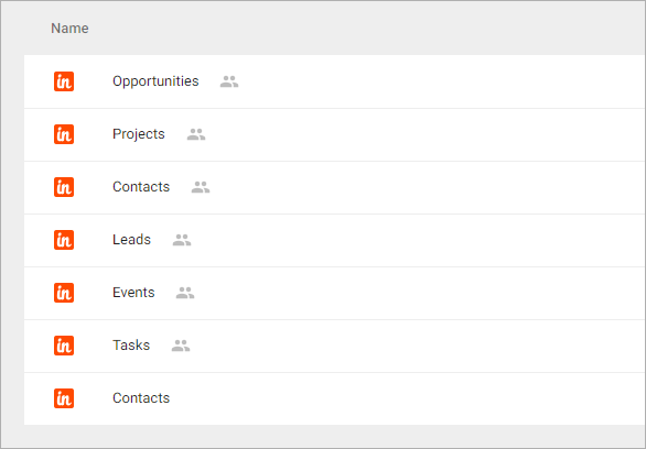
To create a dataset, click your Insightly integration in the list and select Browse datasets. From the following page, select which data you want to add to use in your charts.

NOTE: Cloud Service Integrations have prebuilt data sets that are not editable.

Click dataset’s name for a description of each dataset.

This data source contains information about all of your contacts such as the number of opportunities per contact.

Dimensions

  1. Name – The full name and email address of the contact
  2. Company – The name of the default organization for this contact
  3. Created – Date the contact was initially created
  4. Country – The name of the country from the contact address
  5. Tags – The array of tags associated with this contact
  6. Contact Owner – The full name and email address of the contact owner

+ your Custom Dimensions

Measures

  1. Contacts Count

+ your Custom Measures

Templates

Instead of starting from scratch when building a chart, you can use a pre-built visualization. Simply click one of the templates from the list and it will be added to the dashboard filled with your data. You can then edit and customize this template like a usual chart created by you.

The following templates available for this dataset:

  • Number of Contacts Created by Country (last 6 months) – Track the number of contacts from different countries created over the last 6 months.
  • Top 10 Contacts by Number of Events (last 30 days) – View your top ten open contact by the number of events.
  • Top 10 Countries by Number of Projects (last 6 months) – View your top ten countries by the number of projects over the last 6 months.

This data source contains information about all your events such as conferences you’re attending and other important events.

Dimensions

  1. Title – The title of the event
  2. Location – The location for your event
  3. Created – Date the event was initially created
  4. Start Date – Date when the event work should begin
  5. End Date – Date when the event work should end
  6. All Day – “Yes” if your event is an all-day event

Measures

  1. Events Сount

Templates

Instead of starting from scratch when building a chart, you can use a pre-built visualization. Simply click one of the templates from the list and it will be added to the dashboard filled with your data. You can then edit and customize this template like a usual chart created by you.

The following templates available for this dataset:

  • Cumulative Number of Events Created over the last 30 days – Keep to track growth of the number of the events over the last 30 days.
  • Number of Events Created over the last 30 days – Monitor the total number of events created over the last 30 days.
  • Top 10 Contacts by Number of Events (last 30 days) – View your top ten open contact by the number of events.

This data source contains information about your leads where they came from, and which converted to opportunities.

Dimensions

  1. Name – The full name and email address of the contact
  2. Company – The name of the default organisation for this contact
  3. Created – Date the contact was initially created
  4. Converted – Date the contact was converted
  5. Industry – The name of the industry associated with lead
  6. Status – The status of the lead
  7. Source – The name of the lead source associated with lead
  8. City – The name of the city from the lead address
  9. State – The name of the state from the lead address
  10. Country – The name of the country from the lead address
  11. Converted Contact – The full name and email of the contact that converted from lead
  12. Converted Opportunity – The name of the opportunity that converted from lead
  13. Rating – The rating for this lead
  14. Tags – The array of tags associated with this lead
  15. Lead owner – The full name and email address of the user that owner to this lead

+ Custom Dimensions

Measures

  1. Leads Count – Leads Сount

+ Custom Measures

Templates

Instead of starting from scratch when building a chart, you can use a pre-built visualization. Simply click one of the templates from the list and it will be added to the dashboard filled with your data. You can then edit and customize this template like a usual chart created by you.

The following templates available for this dataset:

  • Number of Leads Created by Industry (last 6 months) – Compare the number of leads created by industry over the last 6 months.
  • Number of Leads Created by Country (last 6 months) – Track the number of leads from different countries created over the last 6 months.

This data source contains information about all tasks, tasks by user or team, as well as all your completed tasks.

Dimensions

  1. Category – The name of category for this task
  2. Priority – The priority of the task
  3. Status – The status of the task
  4. Projects – The names of the projects associated with this task
  5. Assignee – The full name and email address of the user that assigned to this task
  6. Team – The name of the team that assigned to this task
  7. Title – The title of the task
  8. Due Date – Date when the task should be completed
  9. Completed – Date when you mark this task complete
  10. Public – Public visibility. Possible values: “Yes” or “No”
  11. Start Date – Date when the task work should begin
  12. Responsible – The full name and email address of the user who will be responsible for the task
  13. Owner – The full name and email address of the user who created this task
  14. Created – Date the task was initially created
  15. Reminded – Reminder date and time

Measures

  1. Percent Complete – The percentage of completion
  2. Tasks Count – Tasks Сount

Templates

Instead of starting from scratch when building a chart, you can use a pre-built visualization. Simply click one of the templates from the list and it will be added to the dashboard filled with your data. You can then edit and customize this template like a usual chart created by you.

The following templates available for this dataset:

  • Number of Tasks Created by Project (last 12 months) – Shows the tasks summary by projects that have been created over the last year.
  • Number of Tasks Created by Team (last 12 months) – Shows the tasks summary by teams that have been created over the last year.
  • Number of Tasks Created over the last 12 months – Monitor the total number of tasks created over the last 12 months.
  • Task Percent Complete by Project (last 12 month) – Shows the number of tasks by percentage of completion over the last year.
  • Top 10 Assignees by Number of Tasks (last 12 months) – See which of your users is assigned to a most number of tasks.

This data source contains information about all your projects such milestones and the stage of the project.

Dimensions

  1. Name  – The name of the project
  2. Status – The status of the project
  3. Created – Date the project was initially created
  4. Opportunity – The name of the original opportunity
  5. Pipeline – The name of pipeline for this project
  6. Stage – The name of the current sequential stage
  7. Category – The name of category for this project
  8. Completed – Date when you mark this project complete
  9. Started – Date when the project work should begin
  10. Is Converted – “Yes” if your project was converted from an opportunity
  11. Tags – The array of tags associated with this contact
  12. User Responsible – User Responsible

+ Custom Dimensions

Measures

  1. Tasks Count – The number of tasks that linked with this project
  2. Milestones Count – The number of milestones that linked with this project
  3. Linked Projects Count – The number of projects that linked with this project
  4. Projects Count – Projects Сount

+ Custom Measures

Templates

Instead of starting from scratch when building a chart, you can use a pre-built visualization. Simply click one of the templates from the list and it will be added to the dashboard filled with your data. You can then edit and customize this template like a usual chart created by you.

The following templates available for this dataset:

  • Number of Open Projects by Stage and Pipeline – Shows a breakdown of the number of open projects in each of your pipepline stages.
  • Number of Open Projects by Status – Compare the number of open projects by status.
  • Number of Tasks Created by Project (last 12 months) – Shows the tasks summary by projects that have been created over the last year.
  • Number of Tasks Created by Team (last 12 months) – Shows the tasks summary by teams that have been created over the last year.
  • Projects Funnel – Shows the how much projects have reached their completion points.
  • Task Percent Complete by Project (last 10 months) – Shows the number of tasks by percentage of completion over the last year.
  • Top 10 Open Projects by Number of Tasks – View your top ten open project by the number of tasks.

This data source contains information about your opportunities such as the expected close date and the contacts associated with an opportunity.

Dimensions

  1. Name – The name of the opportunity
  2. Status – The status of the opportunity
  3. Created – Date the opportunity was initially created
  4. Currency – The currency for this opportunity
  5. Pipeline – The name of pipeline for this opportunity
  6. Stage – The name of the current sequential stage
  7. Category – The name of category for this opportunity
  8. Type – The interval to indicate whether the bid is a fixed number or charged per hour, per day, etc.
  9. Probability – The number from 1 to 100 representing the probability of winning for this opportunity
  10. Forecast – This is the date you predict the deal will be completed
  11. Close Date – Actual date when the opportunity closed
  12. Reason – The reason when changing the state of an opportunity
  13. Responsible – The full name and email address of the user who will be responsible for the opportunity
  14. Duration – The duration of the opportunity
  15. Linked Tasks – The array of tasks associated with this opportunity
  16. Tags – The array of tags associated with this opportunity
  17. Date of Last Activity
  18. Date of Next Activity

+ Custom Dimensions

Measures

  1. Tasks Count – The number of tasks that linked with this opportunity
  2. Value – Total worth for this opportunity
  3. Amount – Amount for this opportunity
  4. Opportunities Count – Opportunities Сount

+ Custom Measures

Templates

Instead of starting from scratch when building a chart, you can use a pre-built visualization. Simply click one of the templates from the list and it will be added to the dashboard filled with your data. You can then edit and customize this template like a usual chart created by you.

The following templates available for this dataset:

  • Forecast for 6 months – Shows forecasts the number of open opportunities for the next 6 months.
  • Number of Open Opportunities by Stage and by Pipeline – Shows a breakdown of the number of open opportunities in each of your pipepline stages.
  • Number of Opportunities Created by Status (last 6 months) – Shows the number of opportunities created over the last 6 months for each status to compare them to each other.
  • Opportunities Win Rate (last 6 months) – Monitor the number of wins over the past 6 months, and compare it to the total number of opportunities.
  • Top 10 Responsible by Number of Opportunities (last 6 months) – See which of your users is assigned to a most number of opportunities.
  • Total Value of Open Opportunities by Type – Shows forecasts the revenue from your open opportunities by bid type.

This data source contains information about your organizations.

Dimensions

  1. Name
  2. Owner – The full name and email address of the organization owner.
  3. Created at
  4. Can edit
  5. Can delete
  6. Date of Last Activity – Date when last task was completed or email saved
  7. Date of Next Activity

+ Custom Dimensions

Measures

  1. Organizations Сount

+ Custom Measures


Your custom datasets from Insightly

Creating a Chart

Click a dataset or integration and select Create dashboard/Create chart/Create presentation to start building a chart (please note that presentations are available starting from the Standard Plan).

From the next page, you can choose to create your own chart from scratch, or you can apply one of the templates we created.

  • If you choose to build a new chart from scratch (“Blank” option), the Chart designer will open. Go here to learn how to create a chart in the Chart editor.
  • If you choose a template, a new chart will be added to a dashboard/saved chart/presentation (depending on the way you start the chart creation).
Was this article helpful?
Dislike 0
Views: 596