Interaction options enable you to set connections within a group of charts and representation of hovered elements in view mode.
Follow this steps to get to Interaction options:
- In edit mode, click the chart
- Click the gear icon
 in the top right corner of the chart
 - Choose the Format option
- Head over to the Interaction section
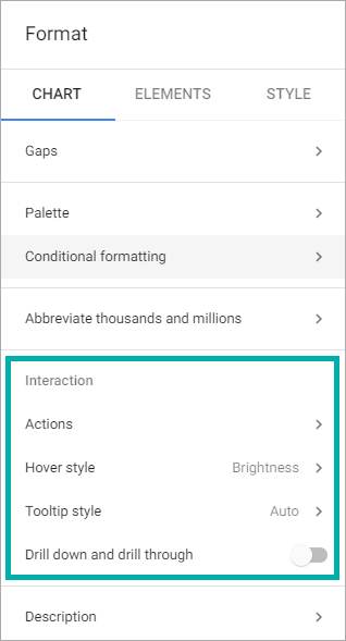
Within the Interaction section, you are able to:
- Create connections between charts
- Set hover style of chart elements
- Set selection style for chart elements
- Set tooltips for chart elements
- Make a detailed analysis of chart data (drill down and drill through options)
Actions
Actions enable you to set data connections between charts. It works as a data filter and change elements in the connected charts automatically according to the selected element in the chart where Actions are set in.
Let’s consider the situation, where you have several charts and you need to create a connection between them. For example, you have a map chart, which shows regions where production is distributed, and a cross-table chart, which represents amount of sales in each region by customer segment and product category. You may want to get specific data on the cross-table chart according to the selected region on the map chart. For this, you should set Actions to make the cross-table data change dynamically when you click one of the map elements.
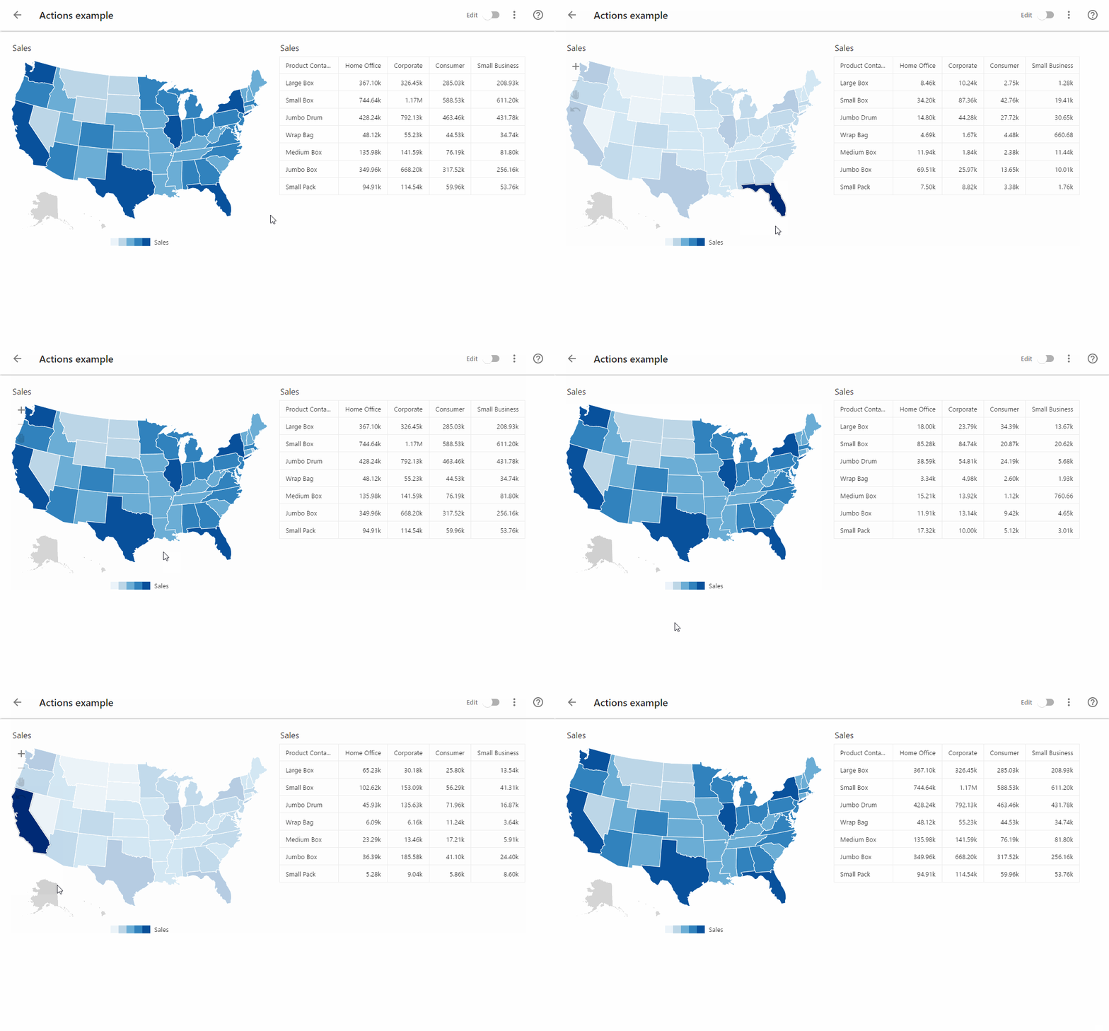
When clicking through the Actions, the following options are available:
- None – no actions are applied
- Highlight – connected charts data is highlighted according to the chosen element
- Selection – connected charts data is updated according to the chosen element
Choose the desired option, and then select charts from the list to which you want to apply the action.
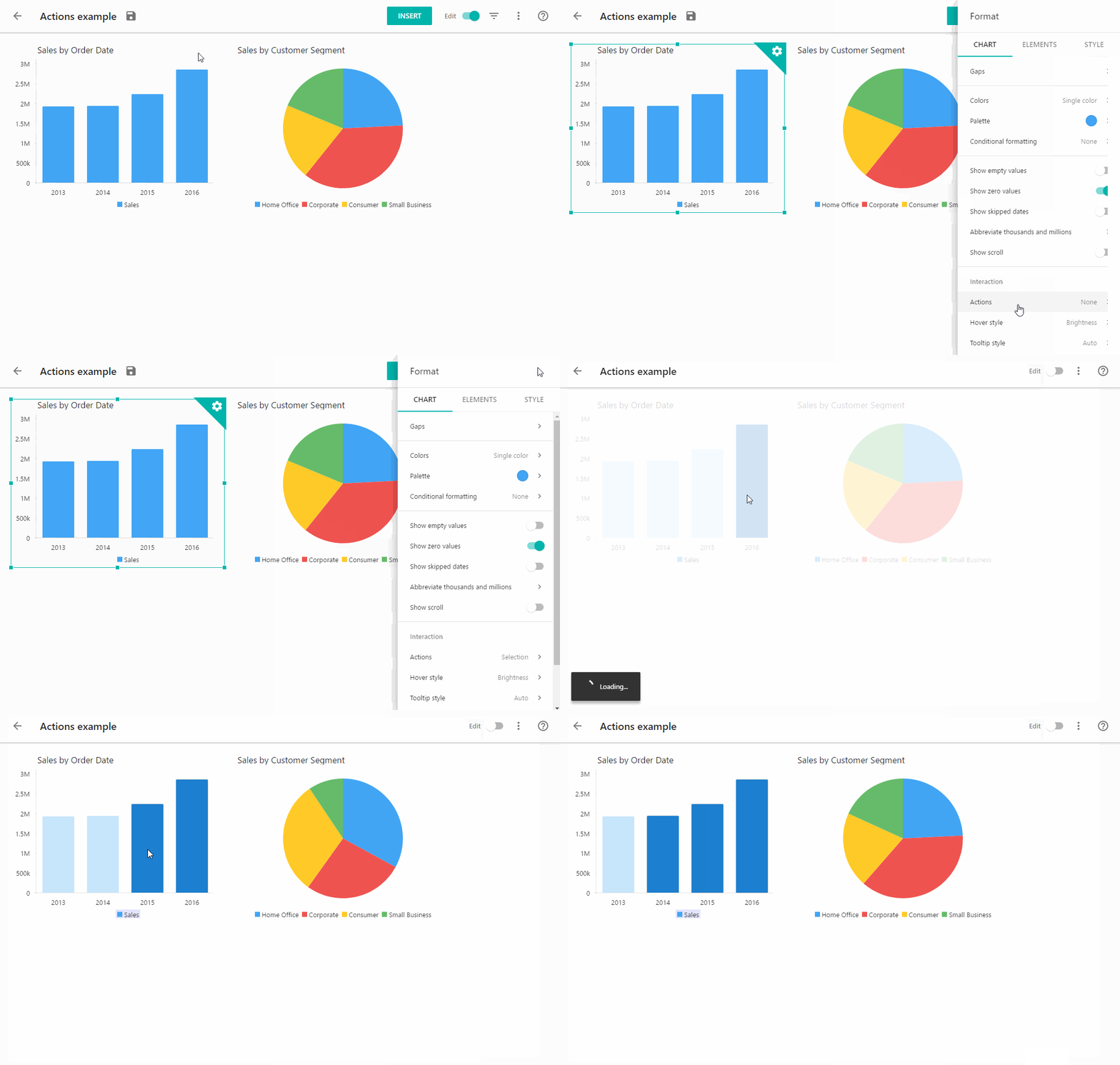
By default, you are able to select several elements in a chart in a View mode. If you want elements to automatically discard selection when you click the next element, select “Single selection” option in the Interaction menu.
NOTE: You are not able to set Actions for Single value, Pyramid and Simple table chart types.
Hover style
Hover style option enables you to emphasize chart elements when the mouse is hovering over the chart element.
When clicking through the Hover style, the following options are available:
- None – the hovered element displays as usual
- Brightness – the hovered element becomes brighter
- Color – the hovered element is painted in the chosen color
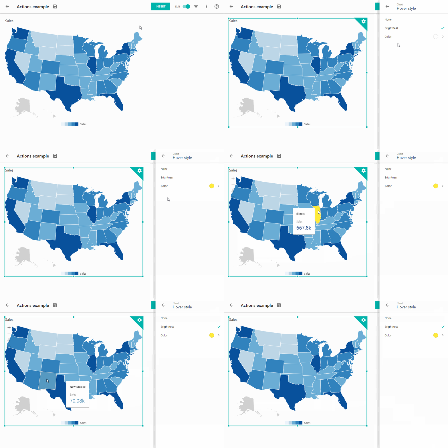
NOTE: You are not able to set the Hover style option to the following chart types: Time series, Single value, Cross-table, and Simple table.
Single selection
Enable Single selection option if you wish to disable multiple selection of chart elements.
Tooltip style
Tooltip is a hint which is displayed when you hover over the data points on your chart. Tooltips show the main quantitative and qualitative characteristics of the data point.
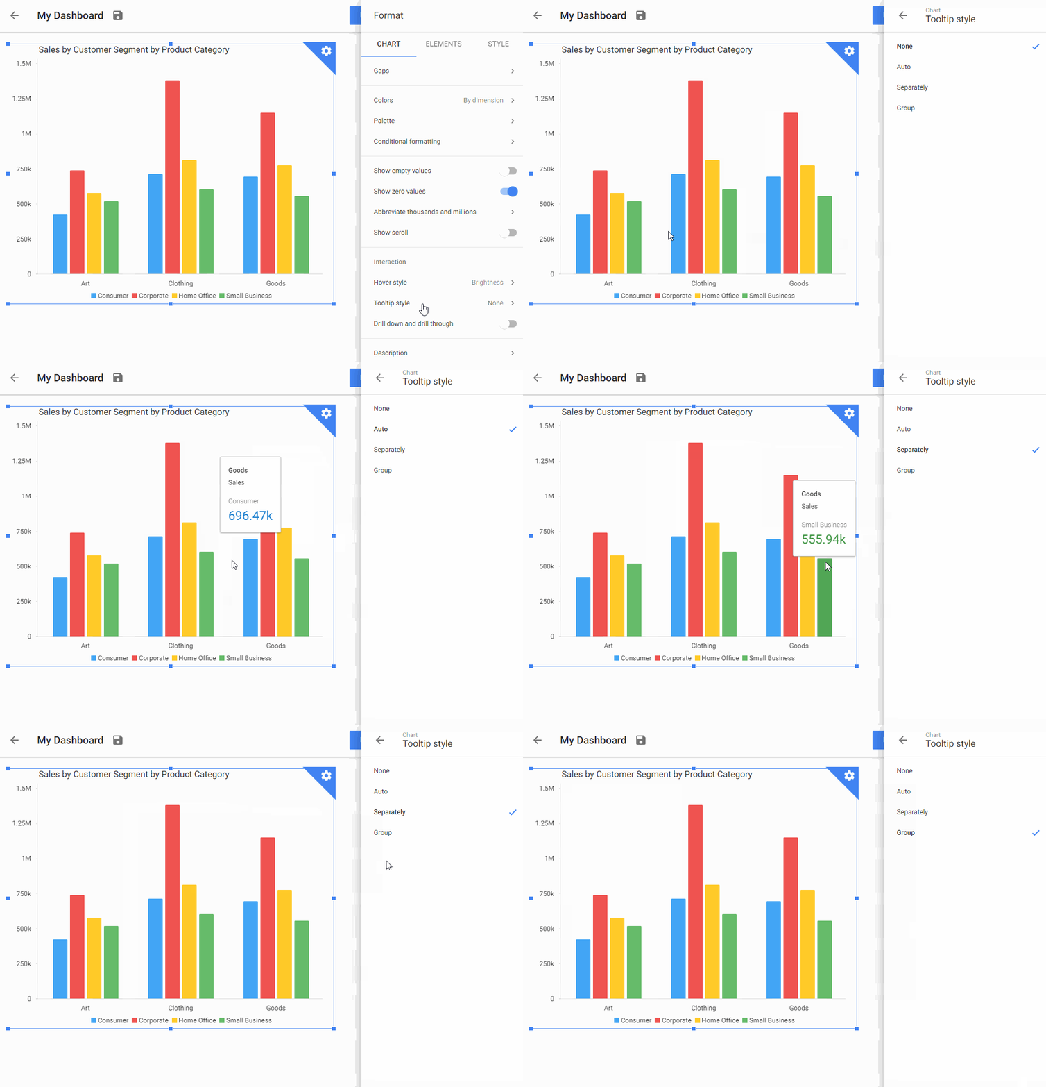
When clicking through the Tooltip style, the following options are available:
- None – no tooltips are displayed.
- Auto:
- Separate elements – tooltip is displayed for the hovered element.
- Grouped elements – tooltip is displayed for the hovered group of elements at one data point. When hovering over an empty space above grouped elements, a single tooltip shows info about each element in the group.
- Separately – tooltip is displayed for the separate chart elements.
- Group – if the chart consists of grouped elements (e.g. stacked columns), the tooltips are displayed for the whole groups.
NOTE: You are not able to set the Tooltip style option to the following chart types: Pie and donut charts, Single value charts, Pyramid, Multicolor, Cross-table, and Pictorial (amount and size).
Drill down and drill through
Drill down and drill through option enables you to dive into the composite data. Use drilling to dig deeper into your data points.
Follow these steps to explore Drill down and Drill through options:
- Activate the Drill down and drill through option from the Format menu of the chart editor. Click Done.
- Turn off the dashboard edit mode.
- Click one of the chart elements. Drill down or Drill through (or both) options will appear in a pop up menu depending on data specifics:
- Drill down runs with charts that has Date dimension and can represent data iteratively from the longest period of time to the shortest (from years to quarters, from quarters to months and so on).
- Drill through works with all the charts and enables you to choose one more dimension for chart data.
- Then you’ll be able to drill further into one of the elements in the appeared chart (if you are not at the lowest level).
- Depending on the chart type of the original chart, you can change the chart type of the detailed diagram by clicking the Chart type option at the top right corner.
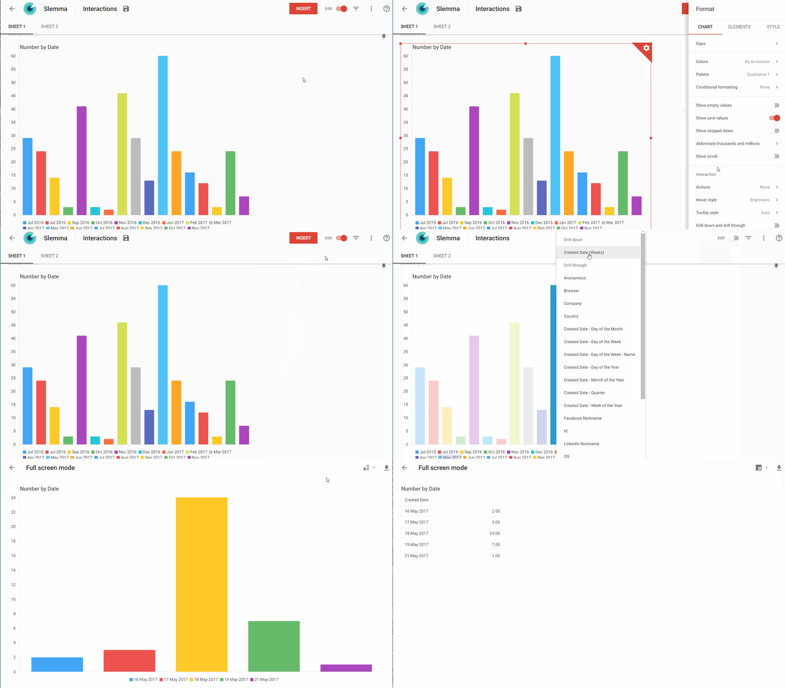
You can stop at any point and export the result as *.csv or *.xls if you want to save a snapshot of the current slice of data.

